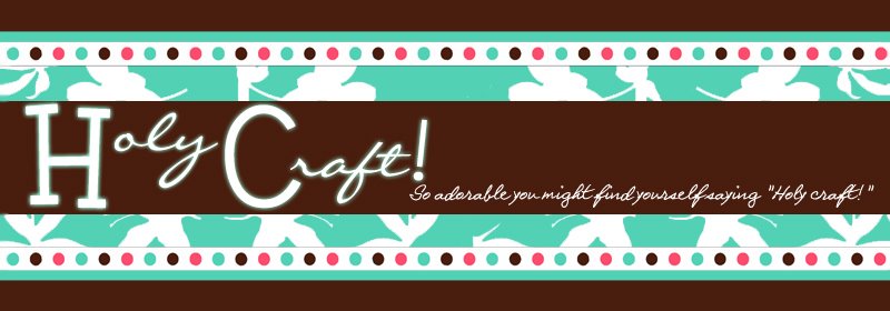
I recently contacted Jenny of Pink Armchair Designs to have her come up with a logo for me. I'm excited to reveal two! Leave me a comment and let me know which one you like better. I know they're similar, but that's why I had a tough time choosing! Jenny is a sweet girl, easy to work with and has amazing designs! She does custom blogs, logos and other designs for great prices. You should definitely check her out!
Saturday, June 14, 2008
Subscribe to:
Post Comments (Atom)


8 comments:
I like the bottom one best. Love the colors!
Amy
I like them both. But I love, love, love the first one. :) I think it's easy to read (especially if printed on small cards, like for bows) but I think it's still fabulous and funky.
My vote is for the first one! I like all the colors! Very cute!
Ang
Abby,
I really love both, but especially love the first one. It really reminds me of those names you used to draw in college with all of the colors extending out from it. Yes, the first one is very you!! :)
I found your site from tip junkie. You have some great designs!
Very cute! I love the first one best :)
I love them both!
I like the font better in the top one, it's thicker and stands out more. But I like the colors of the 2nd one.
see, I gotta go and make things difficult!
Post a Comment